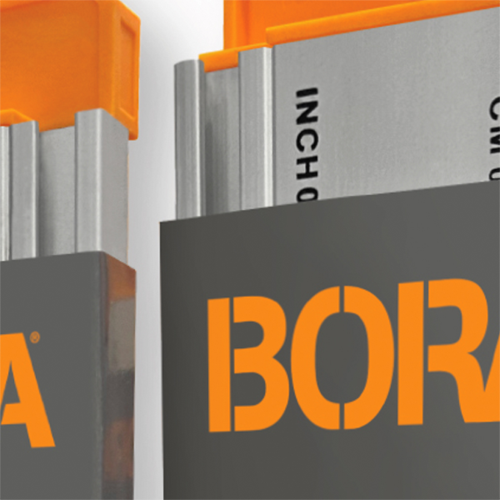
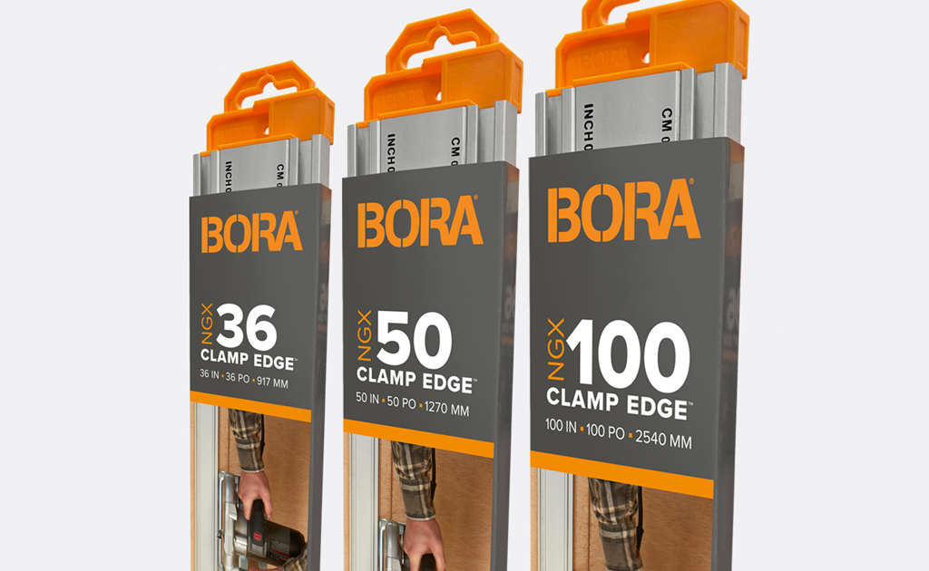
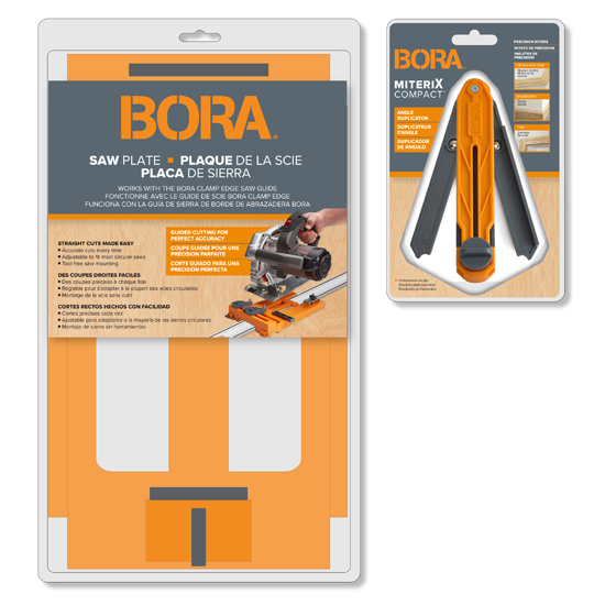
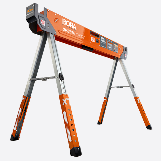
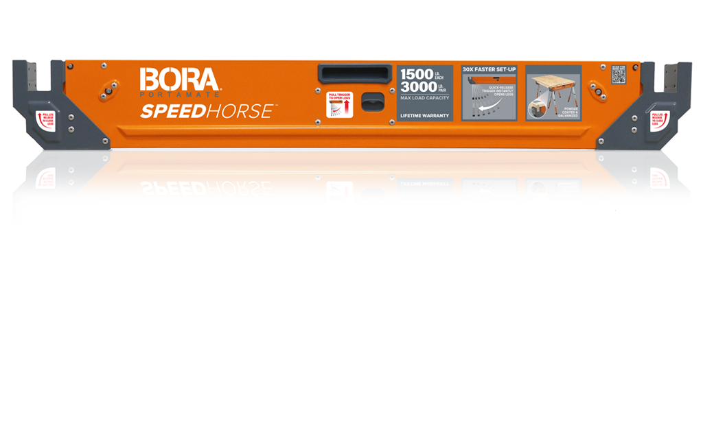
LW redefined the brand with a stronger visual hierarchy and more impactful shelf presence, creating a clearer and more intuitive shopping experience.
Updated graphics introduced a brighter, more contemporary look, while emphasizing product sizes, features, and key differences to reduce shopper confusion at shelf.
A cohesive, bold branding system unified the product family while establishing clear distinction between items—making the line easier to shop and more compelling at shelf.